My name is BILL
Hello. My name is Bill, and I am bored. I think I am going to talk about billboards to make me less bored.
I bet none of my avid followers knew I could be such a “lyrical wordsmith” (credit to South Park for that phrase). But sadly, I am not just here to flaunt my poetic ingenuity. I would actually like to have an intellectual conversation about billboards and discuss MarketingAdAgencies perspective on them. So if you consider yourself to be intelligent, then please stay for the discussion after you have humbled yourself.
There is a certain beauty in billboards that can be found in its simplicity. Stripped of everything else, billboards represent the most basic form of advertisement (unless you want to add a town crier to the equation). But just as technology has taken a giant leap forward in advancement, so have the ideas and ingenuity behind billboards—but herein lies the problem; as do all things in life, the basic principles behind effective billboards has been diluted with an overemphasis in creativity and one upping your competitors in cleverness. After doing what I do best—which is aimlessly browsing the internet for “research”, I have begun to see a similar theme in billboards that I deem to be effective and creative. If you would be so kind as to indulge my intellectual ego, I would like to discuss my findings.
Preliminary Requirements:
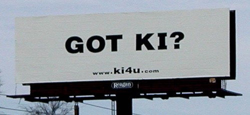
Before the actual design of the billboard takes place, it is extremely important to understand two basic baselines. The first is that you must never assume ANYTHING from the consumer; whether this is assuming they will take a certain action, or assuming that they will understand something that is not explicitly communicated to them. In the picture below, you can see a billboard that made two assumptions. The first, is that they assumed the viewers knew what KI was. The second is that they assumed the viewers would go to the website in order to satisfy their curiosity. Even now, looking at this billboard, I have no idea what it is promoting, let along if a particular company is promoting it.
The second baseline, is that a billboard must be used as a secondary form of advertisement only, and cannot be expected to effectively persuade the population. Billboards must be used in congruence with other marketing efforts to be proven effective. So as long as you keep these two baselines in mind and follow the basic principles listed below, you will be more likely to produce an effective billboard.
Company name or Logo:
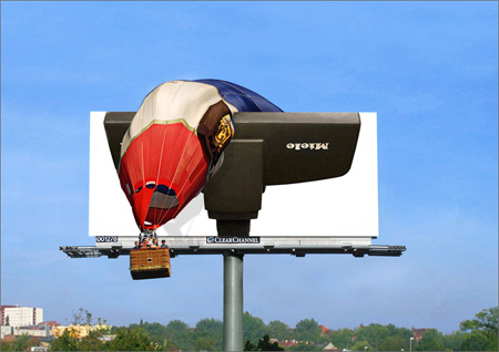
Please, pretty please, with a cherry on top, if you are going to spend finances on a billboard, then Pahhh-Leeease put your company name or logo on the billboard, and if you have already done that, then please make it viewable and readable. As you can see below, the company name is clearly printed on the billboard, but is hard to read due to the fact that it is….UPSIDE DOWN!
Clean and Simple
Taking into account that the majority of your viewers will be driving, It is extremely important to resist the urge to have a cluttered billboard packed with company information. To repeat what I said before, your billboard is a secondary advertisement outlet and should only be used to reinforce prior marketing efforts. To this end, your billboard should be concise with a simple message or a supporting message.
Attention Grabbing
Just because you have a massive billboard on display, does not necessarily mean that a passerby will take notice to it. It will take something special to make the public give your billboard a second glance. Contrasting colors, massive extending billboards, flickering lights, and odd shaped billboards are just a few simple ideas for quick attention grabbing billboards.
Creative
Lastly, your billboard should be creative. If you have done everything else correct, then the creativity and design of the advertisement should be enough to make the billboard memorable. One quote that I loved reading said to “make the billboard creative, but not too creative”. This relates back to the clean and simple principle, along with the “don’t assume your target will understand your witty message” principle. This is probably the most difficult aspect of the billboard design, as you want the creativity to leave a lasting message, but not too creative so that the majority of viewers have no idea what you are trying to communicate.
I have browsed many billboards online now, and have been impressed with the growing amount of creativity put into each billboard. Some with optical illusions and others with compelling images. But despite how creative these billboards are, some of them still lack the effective nudge that is needed to be persuasive. Luckily, after many years of collaboration with the MarketingAdAgency committee (extensive exaggeration), I am pleased to announce that we have found a billboard that have embraced all the basic principles of a good billboard, and earns the highly coveted MarkeintAdAgencies “Stamp of Approval”.
-Company name or Logo clearly visible? (Yes)
-Clean and Simple? (Yes)
-Attention Grabbing? (Double Yes)
-Creative? (H*ll Yes!)
Along with fulfilling all of these principles, the billboard is simply there to support other advertisement attempts McDonalds has previously launched to promote their late night hours.
TL:DR; McDonald’s billboard is a perfect example of what an effective billboard should look like.
Cheers to good Marketing!
Source:
http://www.youtube.com/watch?v=jGwArN-cQxk&feature=related
http://www.youtube.com/watch?v=va2vzo5lc9w
http://www.bpsoutdoor.com/blog/?p=28
http://www.ki4u.com/awards_supporters.htm
http://www.toxel.com/inspiration/2009/01/05/clever-and-creative-billboard-advertising/


